| Railway Preservation News https://www.rypn.org/forums/ |
|
| East Broad Top Number fonts https://www.rypn.org/forums/viewtopic.php?f=1&t=44564 |
Page 1 of 1 |
| Author: | Steamguy73 [ Mon Jun 15, 2020 10:09 pm ] |
| Post subject: | East Broad Top Number fonts |
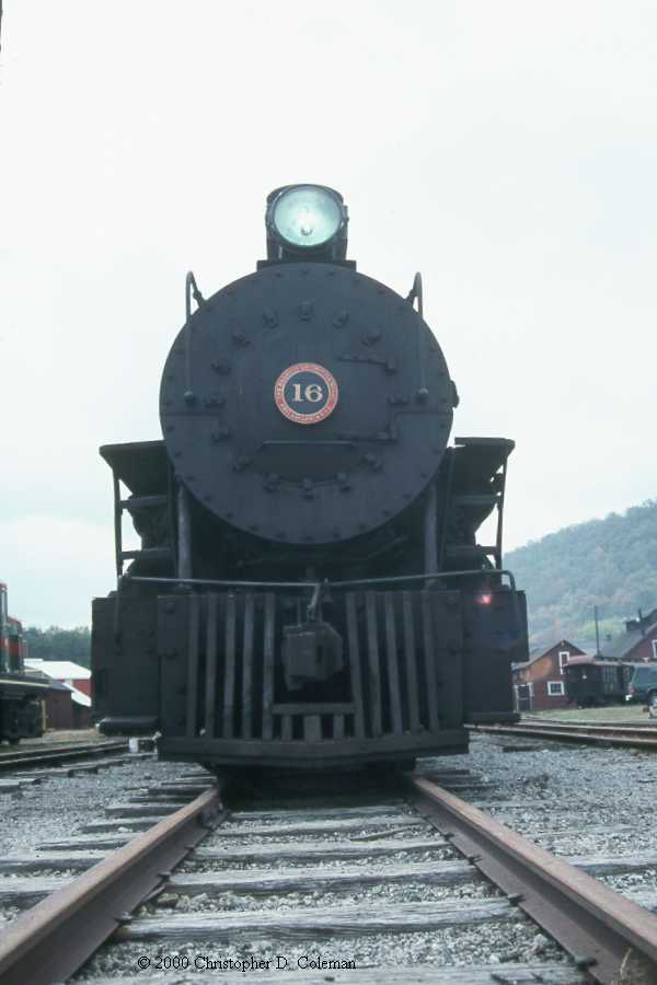
As a casual bystander of the amazing work going on in central PA on the EBT, I’ve taken a particular interest in the railroad, most notably the rolling stock of the slim gauge line. One thing that I’ve been trying to find the answer for is in accordance to #16; for 16 as it appears has a different number font than the other locomotives, even some in a similar situation to it. From what I understand, presumably both 16 and 18 haven’t been painted since the line closed over 60 years ago. 18 was one of the last running locomotives on the EBT, and 16 was in the shops for maintenance as the line was shut down. Now for most EBT locomotives, they have a similar font to the font that appears on the number plates (you can tell by the shape of the #1: it’s flat at the top. 12, 14, 15, 17, and 18 all have a flag topped #1, 16 has a more conventionally shaped sloping #1. Why is this discussion involving 18? Because 18 wears the same font as the other mikes. It’s just odd to me that two different locomotives that supposedly haven’t been repainted in over 6 decades wore different number fonts at the end of operations. For a professional railroad like the EBT that had most if not all of their in service hoppers repainted with the EBT acorn, it’s just odd to me why 1 specific locomotive wears a different font. Here’s a few links to compare the differences 16’s can font recently: http://railfan.com/wp-content/uploads/2 ... EBT800.jpg 18’s cab font and it’s number plate from 1951: https://www.railpictures.net/photo/315490/ 18’s can font compared to 16: https://www.railpictures.net/photoexif/715151/ 16’s numberplate: https://oldeastie.com/Bin/20424.jpg Now, I have seen a photo or 2 with 18 having the same number font as 16 wears now dated back to 1947. This raises a lot of questions. 18’s number font in 1947 (will be hard to see): https://picclick.com/East-Broad-Top-EBT ... id=1&pid=1 As you can (hopefully) see, 18’s font is noticeably larger in this picture here than the font displayed from 1951-present state. Not to mention the details with the #1, and the differences it has to the numberplate. So this begs the question: when did 18’s cab font change from this larger font, to the current font it wears from (presumably) 1951-present? Is there photographic proof that the other mikes, switchers, or even earlier locomotives wear the font 16 wears? And why wasn’t 16’s font changed when it is clear 18 and the other locomotives wore the same number font in the last days of the EBT as a common carrier Maybe I’m looking too far into this, but if anyone has answers or is an expert on the EBT, it would be very appreciated. |
|
| Author: | jayrod [ Tue Jun 16, 2020 10:33 am ] |
| Post subject: | Re: East Broad Top Number fonts |
I can’t speak fo EBT specifically, but generally, things change over time especially with the smaller roads. A lot of times it simply depends on who made the patterns or if done freehand, who held the brush. As an example, I have something like ten different versions of P&WV Roman lettering sets and fifteen different versions of the round herald. At a quick glance, they all look the same. Detailed study shows mostly subtle but significant changes but some were glaringly obvious. It depended on who did the work, what it was applied to and when it was applied. |
|
| Author: | ebtrr [ Tue Jun 16, 2020 4:31 pm ] |
| Post subject: | Re: East Broad Top Number fonts |
I think you are over analyzing this. We are not talking about the Pennsylvania Railroad where everything is standardized. The EBT looks pretty standardized, but it is not so much as it appears at first glance. The window sashes in the shops all look the same, but they vary in size up to and inch, so one does not fit in the opening for another. All those hoppers have various subtle differences from slight variations in the truck design to differing rivet patterns. With regards to the #16 numbers, the EBT was only rebuilding one locomotive at a time. It may just be that in the Paint Shop when #16's turn came, the crew grabbed a different 1 stencil off the wall, or the old stencil was worn out so they made a new one that varied a bit. I can tell you that #16's builder's photo shows a numeral 1 with the flat top, unlike what it wears now. I can't say offhand when it changed, but the curvy top 1 is apparently not a Baldwin thing. Now to really screw with you, #16, #17 and #18 are the same, right? #17 has a welded tender tank, #16 and #18 have riveted tanks. #17's headlight is different from the other two. And there are more differences. This kind of analysis of stuff at the EBT is only possible because it still exists. One of the joys of being and EBT fan. |
|
| Author: | Steamguy73 [ Wed Jun 17, 2020 1:37 pm ] |
| Post subject: | Re: East Broad Top Number fonts |
Yeah that is pretty fair I guess. Given that 18 looks like it had the same font as 16 at one point, it’s my guess that all the other locomotives had a very similar font on their cabs; just so happened that 16 just wasn’t repainted unlike all the others. |
|
| Page 1 of 1 | All times are UTC - 5 hours [ DST ] |
| Powered by phpBB © 2000, 2002, 2005, 2007 phpBB Group http://www.phpbb.com/ |
|